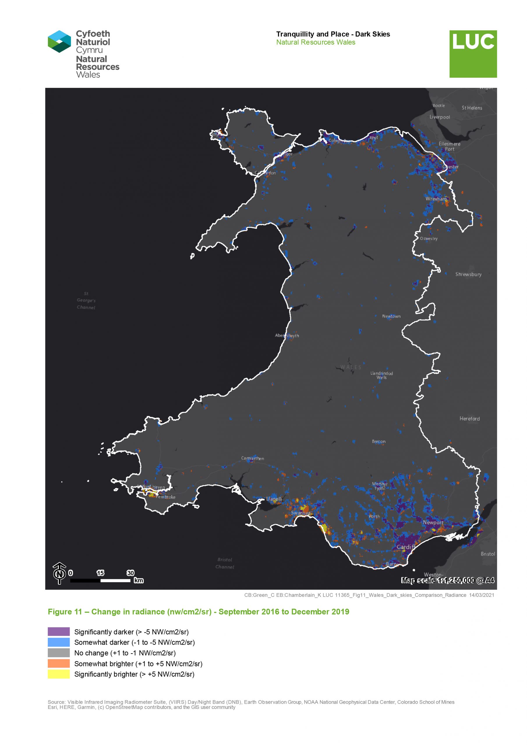
Comparison between 2016 and 2019
One of the outputs from the 2016 mapping of England’s Dark Skies and Light Pollution was a map covering Great Britain. It has been possible to use the 2016 data covering Wales to compare the two sets of data to explore changes in light emission between 2016 and 2019.
Change in radiance units
Figure 11 shows this as a change in nw/cm2/sr, the raw units of radiance contained within the data. Table 5 below sets out how the change levels for this map are defined.
Table 5 Explanation of change for raw radiance units
|
Change magnitude (nw/cm2/sr) |
Change description |
|
> +5 |
Significantly brighter |
|
+1 to +5 |
Somewhat brighter |
|
-1 to +1 |
No change |
|
-1 to -5 |
Somewhat darker |
|
> -5 |
Significantly darker |
Showing the data in this manner highlights areas that may have become significantly darker or brighter over the period 2016-2019. This may not necessarily result in a change in the brightness category used if the change is within the range of that category. This is most relevant in cities and towns, which may already have been in the highest brightness category in 2016, but which have none-the-less become even brighter. Equally, there may be towns and cities in the brightest category in 2016 that have significantly reduced their light emissions, but not enough to move down out of the top category. Comparing just the change between classes would miss these potentially important changes.
The sensor on the satellite that detects this data is less sensitive to bluer wavelengths of light. If street lighting has been converted to LED between the two datasets, then the sensor could be detecting less light, even if the reality is that the overall level is the same or greater.
Figure 11 Change in radiance (nw/cm2/sr) - September 2016 to December 2019
Change between light radiance bands
Figure 12 shows where areas have changed between colour bands (brightness categories). As discussed previously in this report, this study merged the two lowest categories used in the CPRE methodology for Mapping England’s Light Pollution and Dark Skies. For the purposes of this comparison, the CPRE dataset has been recategorised to match the data from this study.
Table 6 sets out how the change levels for this map are defined.
Table 6 Explanation of change for colour bands
|
Change magnitude (Number of colour bands changed) |
Change description |
|
> +2 |
Significantly brighter |
|
+1 or +2 |
Somewhat brighter |
|
No change |
No change |
|
-1 or -2 |
Somewhat darker |
|
> -2 |
Significantly darker |
Showing the data in this way highlights those areas that have had a potentially significant reduction or increase in light emissions; even if that change is relatively minor in terms of the overall amount of light emitted. This will be relevant in more rural areas, where a small change in light pollution may have marked effects on the visibility of the night sky, natural settings and tranquillity. Comparing just the change in raw radiance values would miss these changes, and so would disguise areas where a small change can make a significant difference.
Figure 12 Change between light radiance bands - September 2016 to December 2019

Analysis
The night sky, the patterns of the stars and the shapes of the constellations, have been incredibly important to our ancestors throughout human history. Cave art from as long as 40,000 years ago depict comets, patterns in the stars, and other astronomical phenomena. The gradual movement of stars was used to track time, and cultures around the world created sprawling mythologies and religions about the figures and shapes they saw above them every night.
But our relationship with the stars has changed; our ancestors saw the night sky in a way that is impossible for most of us today; just a handful of the brightest stars are visible in urban areas due to light pollution, the effects of which can be seen in all but the most isolated places. The magic and wonder that our ancestors felt when they looked up at night is lost to many of us.
There are very few areas of the world, especially in countries with large urban populations, that are completely free of light pollution, so it’s vitally important to protect and preserve those few areas that are. Having these areas allows us to visit and see the night sky as our ancestors saw it, and gain some understanding of its importance to the history of our species.
Through examination of the two maps, some obvious patterns emerge. Generally, the city centres appear to be getting darker. This is particularly evident around Cardiff and Newport, which show both a significant drop in radiance, as well as moving to darker bands between 2016 and 2019.
It is possible that this is caused by a move to bluer, LED streetlights. As discussed in the Methodology, the sensor is less sensitive to bluer wavelengths of light. If city street lighting has been converted to LED between the two datasets, then the sensor could be detecting less light, even if the reality is that the overall level is the same or greater.
In contrast, the areas around cities seem to be getting brighter. Whilst they are not experiencing a dramatic increase in terms of radiance values, the change is enough to move them from very dark categories to lighter ones. On the ground, this change may be enough to have a noticeable difference to the local view of the night sky.
The caveat to this is that these lower colour bands are far more vulnerable to tiny changes to the satellite sensor and viewing conditions, as previously explained with regards to the merging of the bottom two bands of colour compared to the 2016 CPRE study. These results should be viewed with this in mind, as there are some indications that this could be, in part, caused by conditions other than increasing light pollution. For example, the fact that some areas of the Bristol channel are showing as being brighter, which is unlikely given that it is an unpopulated waterbody. It is possible this increase is caused by moored ships, but this is difficult to determine from satellite imagery.
However, the fact that these areas are heavily correlated with the outskirts of cities, and the fact that many areas of the country do not show this increase, mean that there is likely an overall increase of light pollution in these areas. This could be confirmed with further studies comparing change over time across more dates, both backwards to the first datasets from the satellite, and forwards for the remainder of its operational life. Alternately, this data could be cross-referenced with ground observations or data showing recent development patterns and lighting policies to see if the changes correspond.
Comparison with local streetlight schemes
Between November 2020 and March 2021, NRW conducted an audit of lighting related information across the local authority areas of Wales. The purpose of this was to identify if spatial street lamp and lighting type information would be available to any future study, and if there were any existing policies and/or guidance relating to dark skies and lighting that would help to interpret the results from the dark skies mapping. It would also provide information relating to changes in the years between the 2016 CPRE study and the December 2019 data, indicating if changes were the result of policies and actions relating to light pollution and dark skies.
For example, comparing the survey response information against the two maps highlights one area of interest in particular; Swansea and the Gower AONB.
In response to the question ‘Is there a scheme within your authority to replace light type?’, Swansea responded;
“The majority of the lighting on Gower has been replaced in the previous 5 years and is now of the Fully Shielded LED type dimmable between the hours of 8pm to 6am with wattages ranging from 10W to 150W. Several sodium lights remain but these are scheduled to be replaced as and when failure occurs.
4000 kelvin LED is standard in Swansea, but units in Gower AONB are being switched to 3000 kelvin as per maintenance schedule.”
The 5 year period does correlate with the change maps. Figure 13 Shows Swansea and the Gower AONB as a change in radiance and as a change between light radiance bands. This shows that there has been a significant reduction in light emission in the centre and west of Swansea, although this is generally not enough to bring areas within Swansea out of the brightest category. Conversely the eastern side of Swansea appears to have brightened significantly between the two datasets.
The change between light radiance bands does show that the areas within the Gower AONB near Swansea have brightened since 2016, however this is all less than +1NW/cm2/sr. If an individual were in the Gower AONB stargazing, the skyglow from Swansea would be the most important limiter on the number of stars that were visible, not the minor effect from the increase in light levels across the Gower AONB itself.
The lighting units within the Gower AONB area are being converted to a warmer colour (3000 kelvin), which the satellite sensor is more easily able to detect. If the streetlights are moving from bluer LED lights to this warmer colour, this may account for some of the increase.
Figure 13 Change in Swansea and the Gower AONB - September 2016 to December 2019

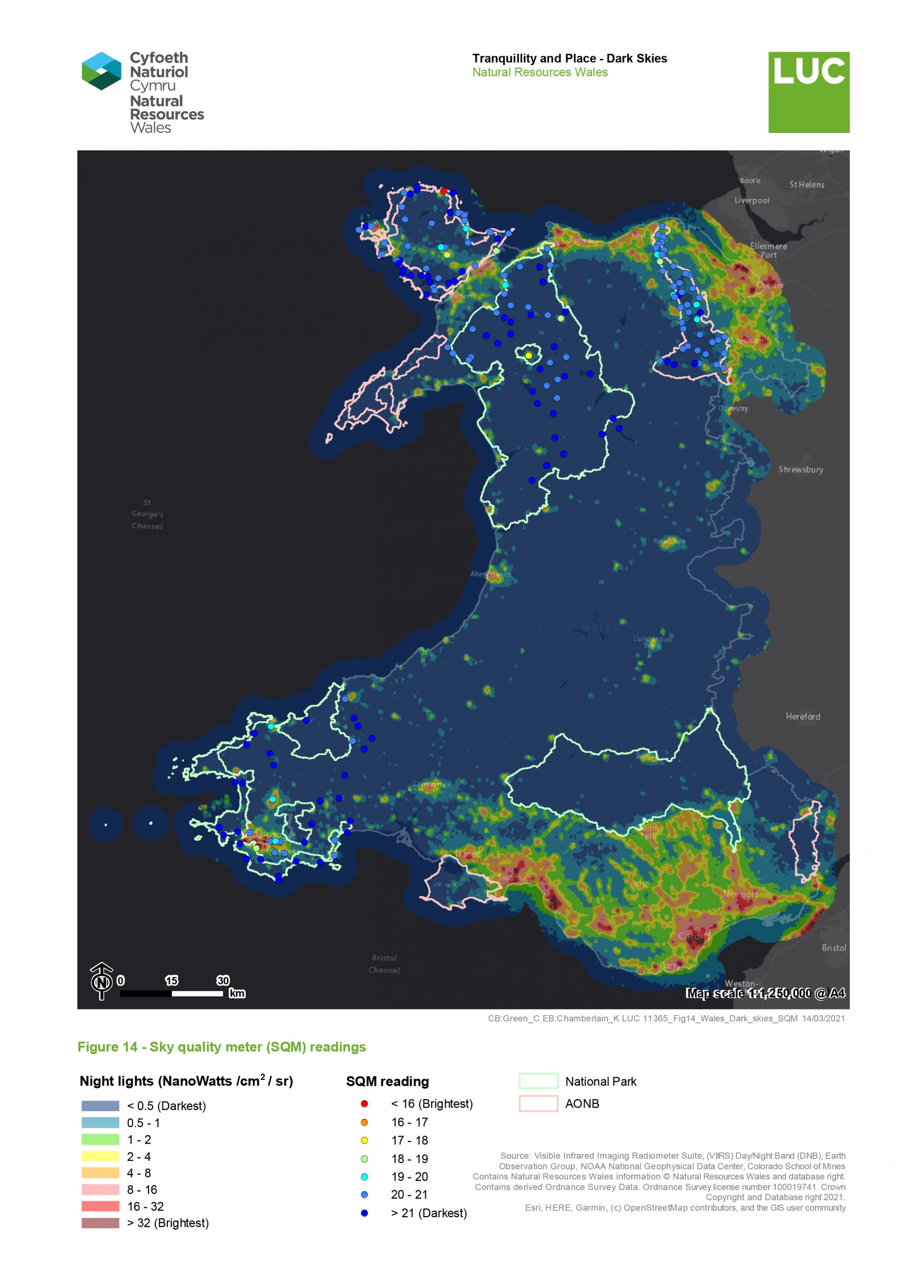
Comparison against Sky Quality Meter data
During the course of this study, we were able to use sky quality meter (SQM) data for the following areas, with the dates chosen to align with the radiance data;
-
Pembrokeshire and Pembrokeshire Coast National Park – 2019/2020
-
Snowdonia National Park– 2018/2019
-
Clwydian Range and Dee Valley AONB – 2018/2019
-
Anglesey AONB – 2018/19
Sky quality meters measure the brightness of the sky at a given point as a number, usually between 16 and 22, with 16 being a sky with extreme light pollution, and 22 being free from any light pollution.
This is mapped for each of these areas in Figure 14. Overall, these readings align very well with the radiance data. Those SQM readings that show more light pollution do correspond with areas of the satellite radiance data that are brighter. It is difficult to draw too many conclusions from this, as the vast majority of the SQM readings are in areas that are extremely dark. However, one area of interest is the Clwydian Range And Dee Valley; this shows lower SQM readings than would be expected from simply looking at the radiance data alone. This is not surprising, as the radiance data does not account for the effect of sky glow caused by the atmospheric scattering of the lights of nearby towns and cities.
Figure 14 Sky quality meter (SQM) readings